The Colour That Will Be Everywhere by Autumn 2026 (and How to Wear It Before Everyone Does)
The colour conversation in fashion operates on two tracks simultaneously. There is what the trend forecasters call it and there is what it actually is in the shops, on the streets, and in the collections that filter down to the high street six months after the runway. The gap between those two tracks is where the interesting dressing happens. Trend forecasting is a genuine industry, led by agencies including WGSN, Pantone, and Coloro, whose annual colour predictions influence everything from runway collections to home furnishing ranges to packaging design. The difference between a professional forecast and a useful wardrobe decision is considerable.
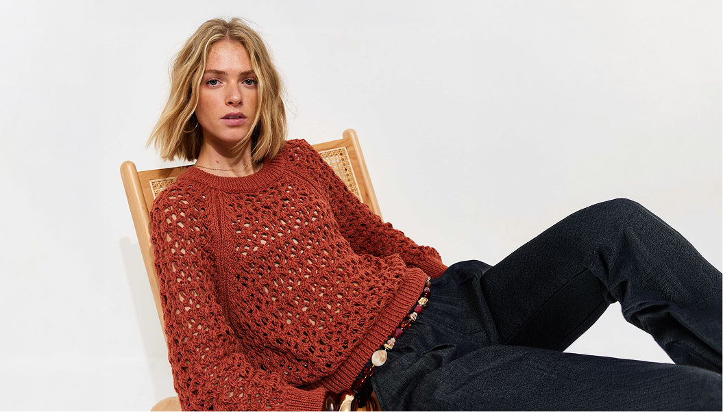
The colour that has been moving through the runway collections of 2025 and into the better independent retailers in early 2026 is a deep, warm terracotta, earthier and more dusty than the burnt orange that appeared briefly in 2021. It sits closer to dried clay than to rust, and it works across a wider range of skin tones than most warm colours because of its grey undertone, which prevents it reading as too orange or too red against cooler complexions. Designers including Bottega Veneta, Toteme, and several of the stronger Scandinavian independent labels showed versions of it across their autumn and winter 2025 collections.
The most interesting dressing happens in the gap between what the forecasters call it and what it actually looks like in real life.
The colour that has been moving through the runway collections of 2025 and into the better independent retailers in early 2026 is a deep, warm terracotta, earthier and more dusty than the burnt orange that appeared briefly in 2021. It sits closer to dried clay than to rust, and it works across a wider range of skin tones than most warm colours because of its grey undertone, which prevents it reading as too orange or too red against cooler complexions. Designers including Bottega Veneta, Toteme, and several of the stronger Scandinavian independent labels showed versions of it across their autumn and winter 2025 collections.
The most interesting dressing happens in the gap between what the forecasters call it and what it actually looks like in real life.
For women, the easiest entry point is knitwear. A terracotta roll-neck worn with wide-leg navy trousers is a combination that photographs well and wears even better, requiring no accessories and no thought once you have worked out you like it. The relationship between terracotta and navy is one of those colour pairings that should not work as well as it does: complementary without being obvious, warm without being overwhelming. Terracotta with cream leans more relaxed and summery. With camel it becomes very wearable and seasonless.
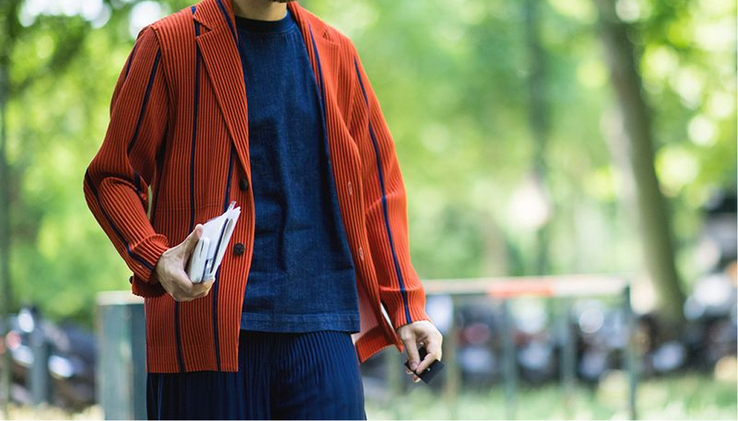
For men, the same tone in a utility jacket, a relaxed shirt, or a pair of wide-cut trousers reads differently: warmer than a traditional neutral, more directional than khaki, but still compatible with the existing contents of most wardrobes. Terracotta works with black, which sharpens it. With cream it softens. With grey it becomes surprisingly versatile and appears more mainstream than it actually is, which is useful if you want to wear something directional without announcing it.
For men, the same tone in a utility jacket, a relaxed shirt, or a pair of wide-cut trousers reads differently: warmer than a traditional neutral, more directional than khaki, but still compatible with the existing contents of most wardrobes. Terracotta works with black, which sharpens it. With cream it softens. With grey it becomes surprisingly versatile and appears more mainstream than it actually is, which is useful if you want to wear something directional without announcing it.
The practical approach to any emerging colour is to test it before committing. A scarf, a knit, or a small accessory in the colour costs a fraction of a coat or a tailored piece and tells you within a few wears whether the tone works with your complexion and your existing wardrobe. If it does, you can buy with more confidence. If it does not, the loss is manageable.
The other thing worth noting is timing. This colour will be fully mainstream by late 2026, which means the pieces available now, from the designers and independent makers who found it early rather than the mass-market labels reproducing it later, are better
The other thing worth noting is timing. This colour will be fully mainstream by late 2026, which means the pieces available now, from the designers and independent makers who found it early rather than the mass-market labels reproducing it later, are better
made and more interesting than what will be available when it saturates the high street. Buying now gives you the better version of the trend, at the moment when the quality is highest.
Log in to your benefits hub to browse the style and fashion section for current discounts across clothing and accessories brands. This is the time to build ahead of the season rather than catch up with it.
STYLE DISCOUNTS FOR MEMBERS
Fashion and accessories offers from leading brands, available exclusively to members. Log in to your benefits hub to browse style offers
Log in to your benefits hub to browse the style and fashion section for current discounts across clothing and accessories brands. This is the time to build ahead of the season rather than catch up with it.
STYLE DISCOUNTS FOR MEMBERS
Fashion and accessories offers from leading brands, available exclusively to members. Log in to your benefits hub to browse style offers

Features